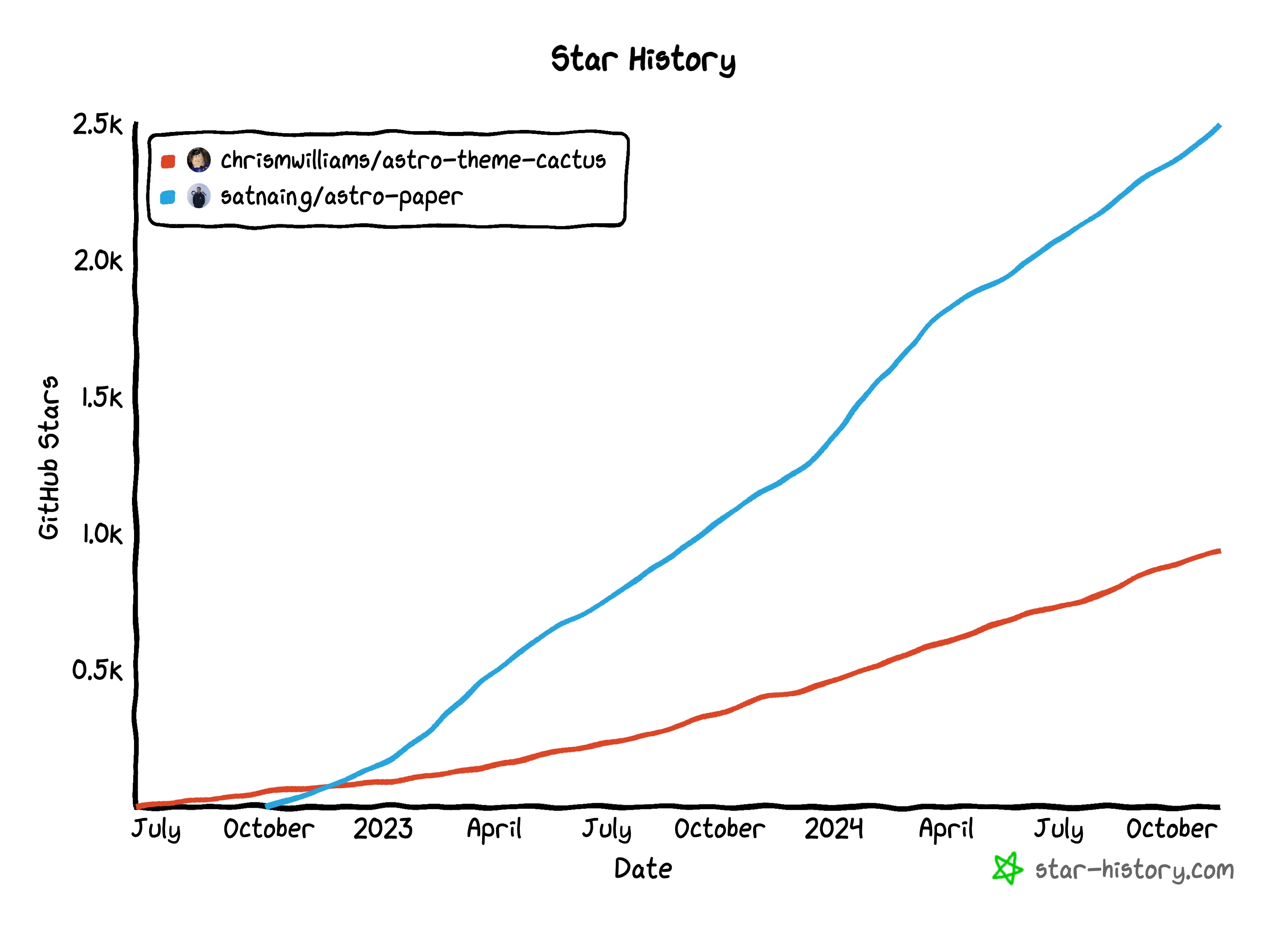
As a pragmatic perfectionist, template choice engenders internal conflict. On the one hand, I appreciate how much time and effort a well-crafted template can save. On the other hand, I don’t feel comfortable using code that I don’t understand, so a template that’s more “complete” can feel like a liability. In choosing a basis for this blog, I mainly considered two minimalist, blog-oriented templates: Astro Cactus and AstroPaper.
I started with AstroPaper because it’s far more popular than Astro Cactus, as the star history chart below demonstrates. But it wasn’t the right choice for me. While trying to implement new features, AstroPaper felt like something I had to slog through rather than a foundation to build on.

comparing features
In terms of features, both templates have advantages and disadvantages. AstroPaper is a more built-out template, with view transitions, giscus comments, more complete navigation (next/previous, breadcrumbs), “featured articles”, and a more sophisticated theming system. But AstroPaper also has a number of features that don’t appeal to me, like an “edit this page on github” button, support for multiple authors, and the ability to set a future publication date.
Astro Cactus does have some features that AstroPaper lacks, like full text search and markdown admonitions. Astro Cactus’s most distinctive feature, however, is webmentions, which isn’t something I plan to use anytime soon. Comparing the demo site for AstroPaper to the one for Astro Cactus, Paper comes across as more complete and polished. Superficially, AstroPaper seems like the better choice1.
code quality
Astro Cactus’s code, however, is much better written than Astro Paper. Components have names that are less ambiguous and more descriptive of their purpose. Utility functions are bundled into sensible modules and are generally well-commented, instead of the warren of single-function modules you find in AstroPaper.
One example that stands out in particular is the way each template handles switching between dark and light mode. Astro Cactus has a component called ThemeProvider that injects an inlined script into the base layout. AstroPaper offers essentially the same functionality, but instead of being a component it’s a vanilla JS script in the /public directory, which has clearly been copied from somewhere else on the web. Astro Cactus’s creator, Chris Williams, seems to have a deeper understanding of modular frontend development than AstroPaper’s creator, Sat Naing. Or at least more experience as a developer.
documentation
The difference that clinched it for me was the way that the two projects handle documentation. AstroPaper’s documentation comes almost exclusively through sample blog posts that are pre-installed with the template; comments in the code are vanishingly rare. Astro Cactus, on the other hand, has scant sample blog posts but detailed and helpful comments throughout the code. AstroPaper’s documentation is marketing material for the template itself, whereas Astro Cactus’s documentation is there to help you as you actually build something.
takeaways
- When it comes to free code, always look that gift horse in the mouth, especially for a template that you’ll be spending a lot of time with. Clone the repo and poke around before you commit.
- Glitzy documentation is no substitute for clear, thoughtful code comments. Well-placed comments put documentation closest to where you’ll be using it.
- Look out for projects that strike a good balance between self-promotion and genuine utility. Open source is often a self-promotion game, and the projects that strive hardest to be perceived as high-quality might have better directed that effort elsewhere. Look past style for substance.
Footnotes
In practice most of the incremental pre-built UI that AstroPaper provides is quick and easy to implement on top of Astro Cactus, especially if you’re using an AI coding assistant. ↩